
10 Website Accessibility Features Every Site Needs
Palak Agrawal
Published on November 16, 2026
11 min read
Share on:
Can everyone who visits your website use it without difficulty? Think about someone who relies on a screen reader, navigates with a keyboard instead of a mouse, or needs larger text to read your content. Can they access the same information and complete the same actions as everyone else?
That's what website accessibility addresses. Yet, many websites still fall short. The 2026 WebAIM Million report found WCAG failures on 95.9% of the top one million home pages, with an average of 56.1 errors per page.
The good news is that most accessibility issues come from a relatively small number of recurring problems, and you can fix many of them with straightforward changes.
In this web accessibility guide, we'll walk you through 10 essential website accessibility features, explain the standards behind them, and show you why your team should make WCAG compliance and ADA website compliance part of its website management process.
What Is Website Accessibility?
Website accessibility, or web accessibility, means designing and developing websites that everyone can use, including people with visual, hearing, motor and cognitive disabilities.
The World Health Organization estimates that 1.3 billion people, or 16% of the global population, live with a significant disability. That's a considerable audience you could leave out if your website doesn't account for different accessibility needs.
What Are the Web Accessibility Guidelines?
The web accessibility guidelines published by the World Wide Web Consortium (W3C), known as the Web Content Accessibility Guidelines (WCAG), provide a framework for evaluating accessibility.
WCAG follows four principles. Your website content must be:
- Perceivable: Users must be able to access information through at least one of their senses.
- Operable: Users must be able to navigate and interact with website elements.
- Understandable: Your content and interface should be easy to follow.
- Robust: Your website should work with different browsers and assistive technologies.
WCAG defines three conformance levels: A, AA and AAA. Most accessibility requirements and regulations use Level AA as their benchmark. The current version is WCAG 2.2.
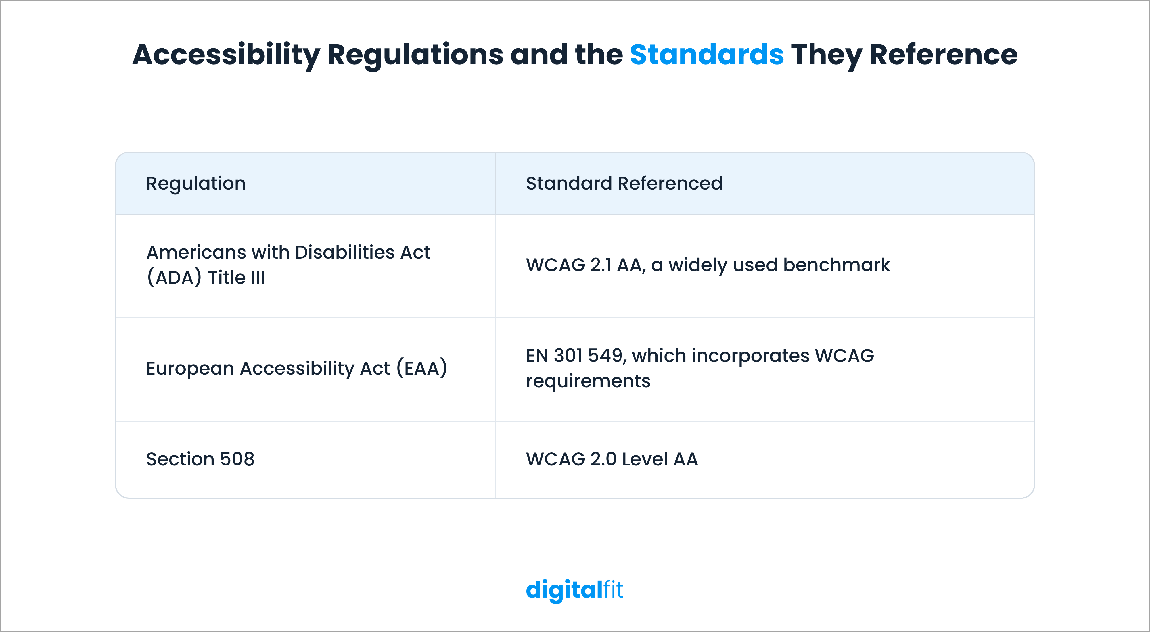
Several regulations also refer to these standards:
- Americans with Disabilities Act (ADA): Title III applies to businesses that provide goods and services to the public. Although it doesn't specify a technical website accessibility standard, WCAG 2.1 AA is a widely used benchmark for ADA website compliance.
- European Accessibility Act (EAA): This legislation has applied since 28 June 2025. It covers specified products and services offered to EU consumers and uses EN 301 549, which incorporates WCAG requirements.
- Section 508: This US federal requirement covers information and communication technology used by federal agencies. Its accessibility standards incorporate WCAG 2.0 Level AA.
10 Website Accessibility Features You Should Implement
Understanding accessibility standards is one thing. Putting them into practice on your website is another.
Below are 10 website accessibility features that your website must have. They address common accessibility problems and give your development team clear areas to review.
1. Add Descriptive Alt Text to Images
Imagine visiting a website where important information appears only in images. If you use a screen reader, how would you know what those images communicate?
That's why you need alternative text (alt text).
Alt text describes the content or purpose of an image so screen readers can convey that information to users who cannot see it. According to the 2026 WebAIM Million report, 53.1% of home pages had images with missing alternative text.
When adding alt text, describe what the image communicates rather than simply listing what's visible.
For example, for the below image, instead of writing "image of a car," use "A technician inspecting a car engine during quality testing." Because this is what the image represents.

You should also leave the alt attribute empty for decorative images. This tells screen readers to skip them rather than announce unnecessary descriptions.
2. Support Keyboard Navigation and Visible Focus
Not everyone uses a mouse to navigate your website. Some users rely entirely on a keyboard to move between links, buttons, menus and form fields.
Your website should let them access every interactive element using keyboard controls like Tab, Enter and the arrow keys.
Pay attention to two things:
- Keyboard navigation: Users should be able to move through interactive elements in a logical order without getting stuck.
- Visible focus indicators: When users select an element using the keyboard, show a clear outline or other visual indicator so they know where they are.
WCAG 2.2 also introduces requirements around focus visibility and sets a minimum target size of 24 × 24 CSS pixels for many interactive controls, subject to specific exceptions.
A simple way to test this is to unplug your mouse and navigate through your website using only your keyboard. Check whether you can access every important feature and complete key actions.
3. Maintain Sufficient Colour Contrast
A quick question: can you read this text?

Maybe you can, but it is very difficult. Now imagine dealing with that problem across an entire website.
Poor colour contrast makes content difficult to read, particularly for people with low vision or colour vision deficiencies.
It's also one of the most common accessibility failures. The 2026 WebAIM Million report found contrast errors on 83.9% of home pages.
WCAG Level AA specifies these minimum contrast ratios:
- 4.5:1 for normal-sized text.
- 3:1 for large text.
Check the contrast of your body text, headings, buttons, placeholder text and text placed over images. Also, avoid using colour as the only way to communicate information. For example, pair a red error indicator with a clear error message instead of relying on colour alone.
4. Use Semantic HTML and a Clear Heading Structure
Your website might look organised visually, but can assistive technologies understand its structure?
Screen readers use HTML elements to identify headings, navigation menus, lists, tables and other page sections. When developers use the right elements, users can move through the content more easily.
Follow these practices:
- Use one clear H1 for the main page heading.
- Organise sections using H2 and subsections using H3, H4 and other heading levels in the correct order.
- Use semantic elements like <nav>, <main>, <button> and <table> for their intended purposes.
- Avoid using heading tags only to change the appearance of text.
A logical HTML structure also makes your content easier for search engines and AI answer engines to interpret.
5. Make Forms Accessible
Forms are where users sign up, submit enquiries, request information and complete purchases. If someone cannot understand or fill out a form, they might abandon the process altogether.
The 2026 WebAIM Million report found that 51% of home pages had form inputs without proper labels.
To make your forms accessible, follow these practices:
- Add a visible label to every input field and associate it with the correct field.
- Clearly identify required fields instead of relying only on colour or symbols.
- Write error messages that explain what went wrong and how users can correct it.
- Make sure users can navigate and submit forms using a keyboard.
- Give users clear feedback after they submit a form.
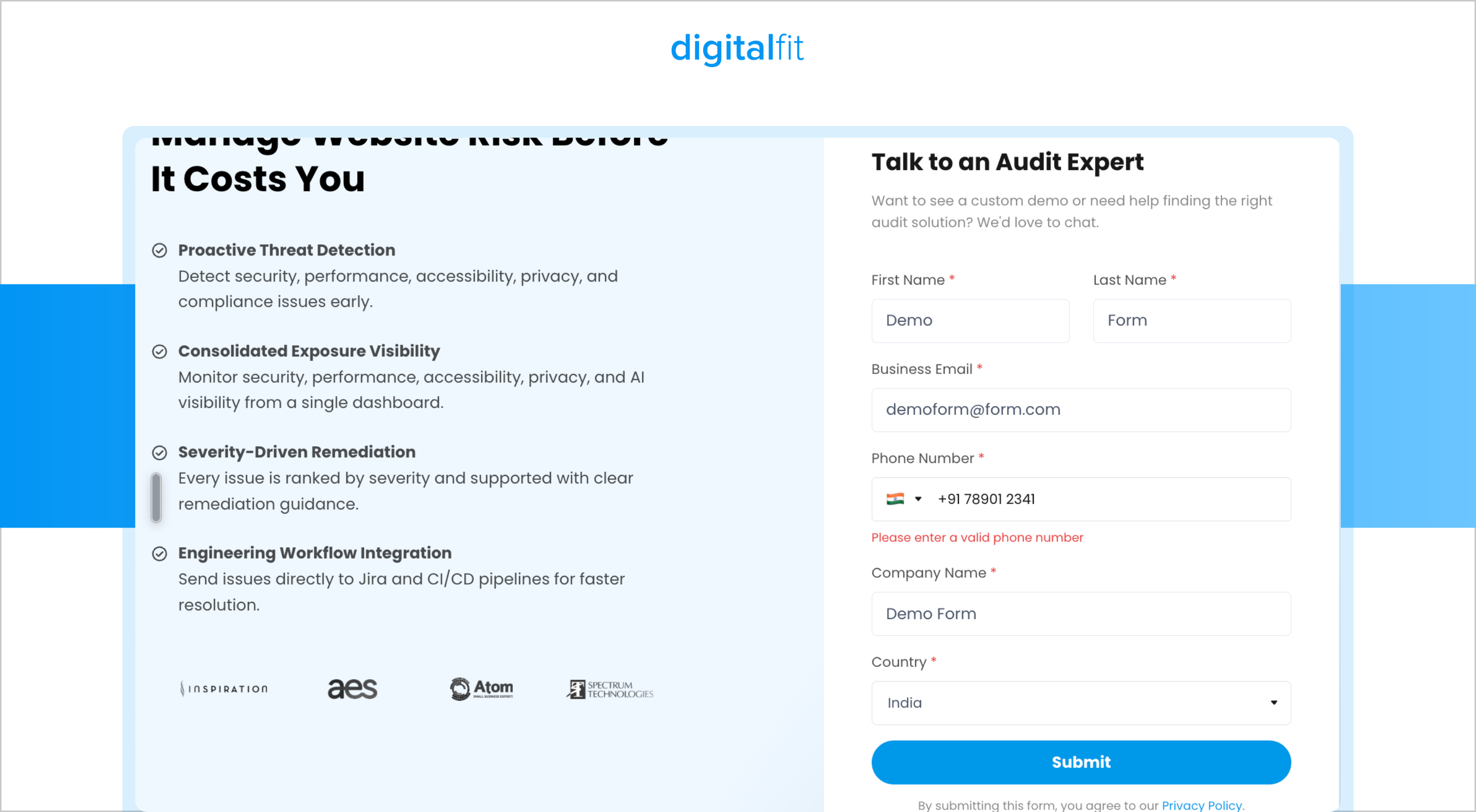
For instance, instead of displaying a generic "Invalid input" message, tell users, "Enter a valid email address to continue."
These small changes make it easier for everyone to complete your forms.
6. Write Descriptive Link and Button Text
Do your links tell users where they'll go when they click them?
Labels like "Click here," "Read more" and "Learn more" don't provide much context, especially for screen reader users who navigate a page by jumping between links.
The WebAIM report also found empty links on 46.3% of home pages and empty buttons on 30.6%.
Give your links and buttons meaningful labels that explain their purpose.
For example:
- Instead of "Read more," use "Read our website accessibility checklist."
- Instead of "Click here," use "Download the accessibility report."
- For icon-only buttons, provide an accessible name that explains the action.
This way, users can understand what each element does without having to read the surrounding content.
7. Add Captions, Transcripts and Audio Descriptions
If your website includes videos, podcasts or other multimedia content, do add captions, transcriptions and audio descriptions. This helps make multimedia content accessible to a wider audience.
The World Health Organization estimates that more than 430 million people worldwide have disabling hearing loss.
Adding these features helps them access your content. It also benefits people watching videos in noisy environments or browsing with their sound turned off.
8. Allow Text Resizing and Support Responsive Layouts
Small text, overlapping content and layouts that break when users zoom in can make your website difficult to navigate.
People with low vision often increase text size to read content comfortably. Your website should support this without hiding information or breaking its functionality.
Keep these points in mind:
- Allow users to resize text up to 200% without losing content or functionality.
- Use relative units such as rem and percentages instead of relying entirely on fixed pixel values.
- Build responsive layouts that adjust to different screen sizes.
- Make sure content reflows properly at 400% zoom, where applicable under WCAG requirements.
Test your website on different devices and screen sizes. Check whether users can still read the content, access menus and complete actions without horizontal scrolling across ordinary page content.
9. Add Skip Links and Keep Navigation Consistent
Imagine having to move through 20 navigation links every time you open a new page just to reach its main content. That's what keyboard users might experience without a skip link.
A skip link allows users to bypass repeated navigation elements and jump directly to the main content.
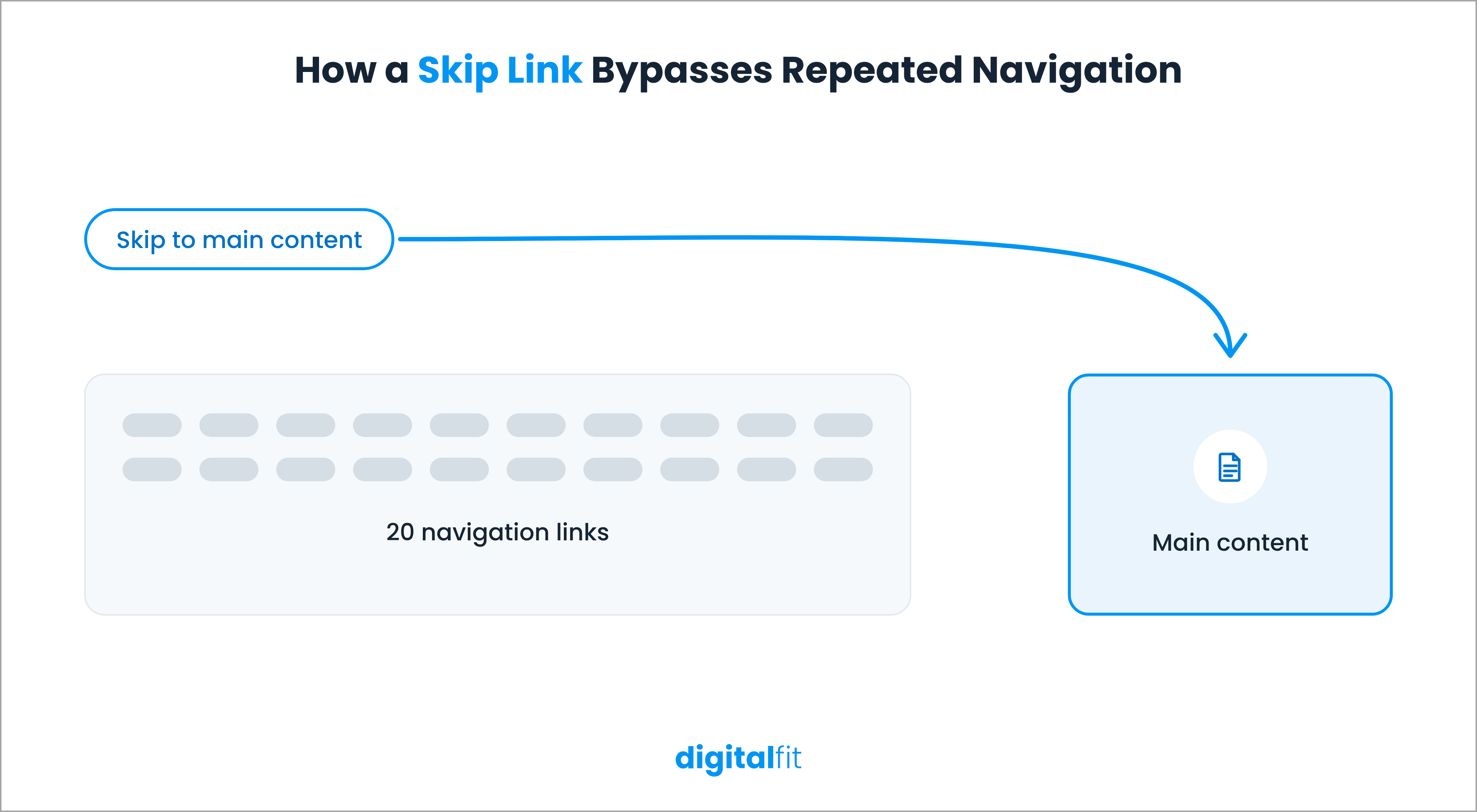
You should also keep your navigation structure consistent across your website. Place menus, search options and help links in predictable locations so users don't have to figure out a new layout every time they visit another page.
These changes reduce unnecessary navigation and make your website easier to use.
10. Use ARIA Correctly and Test Screen Reader Compatibility
Accessible Rich Internet Applications or ARIA attributes help developers communicate information about interactive elements to assistive technologies.
Developers, for instance, can use ARIA to identify the expanded or collapsed state of a custom menu or announce a status message when a user completes an action.
However, adding ARIA attributes everywhere doesn't automatically make a website accessible.
In fact, the 2026 WebAIM Million report found that home pages using ARIA had an average of 59.1 detected errors, compared with 42.0 on pages without ARIA.
This doesn't mean you should avoid ARIA. It means you should use it only when necessary and implement it correctly.
Start with native HTML elements wherever possible. Then use ARIA when standard HTML doesn't communicate the required information.
Finally, test important website journeys with screen readers like NVDA, JAWS and VoiceOver. Check whether users can understand page content, navigate interactive elements and complete essential tasks.
Why Should You Follow Web Accessibility Guidelines?
Adding accessibility features takes time, but ignoring accessibility can create bigger problems for your business.
Here are six reasons to make the web accessibility guidelines part of your website development and maintenance process.
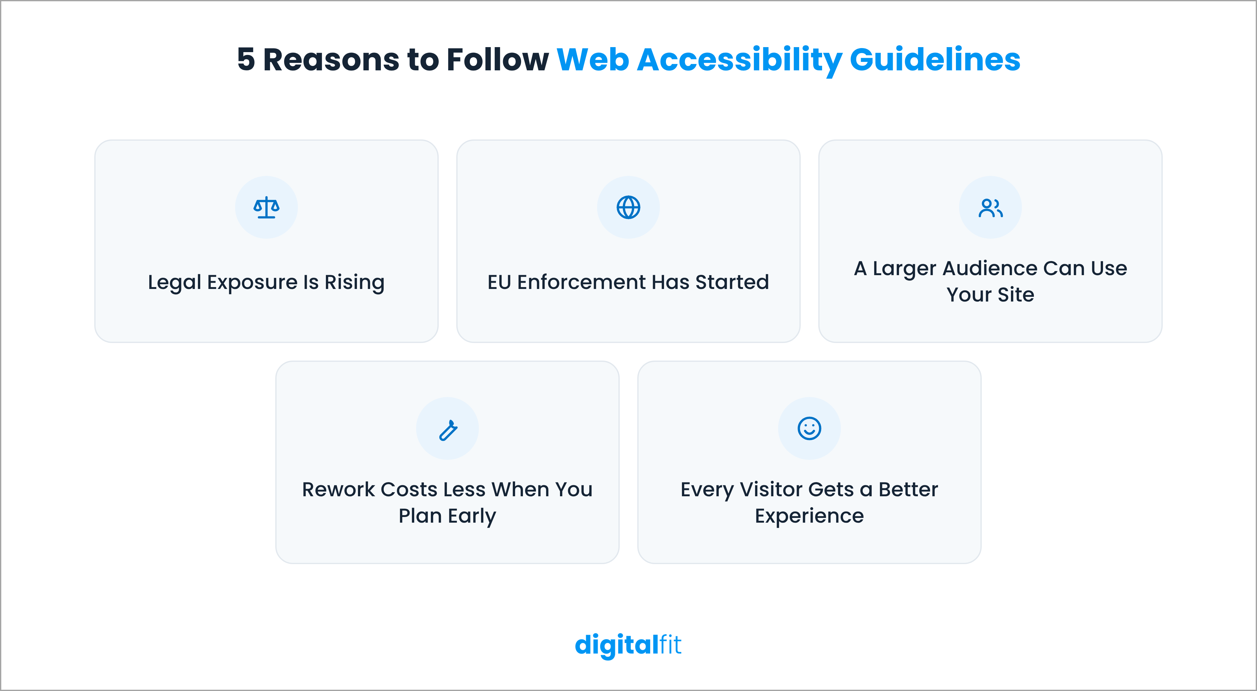
1. Legal Exposure is Rising
Plaintiffs filed 3,117 federal web accessibility lawsuits under ADA Title III in 2025, a 27% increase on 2024. These cases made up 36% of all federal Title III filings.
2. EU Enforcement has Started
The European Accessibility Act has applied since 28 June 2025, and penalties vary by member state, from fines to service suspension.
3. A Larger Audience can Use Your Site
1.3 billion people live with a disability, and every inaccessible checkout or form turns part of that audience away.
4. Rework Costs Less When you Plan Early
Building accessibility into design and development avoids the expense of retrofitting when a compliance issue forces the change.
5. Every Visitor Gets a Better Experience
Captions, strong contrast and keyboard support help users on phones, in bright light and in quiet places.
Check Your Website's Accessibility With DigitalFit
Ten features cover most of what WCAG compliance asks of a business website, and this web accessibility guide gives your team a checklist to work from. Most failures come from a short list of repeatable issues, which makes them quick to find with the right audit.
Your team can then fix them in order of impact and recheck after each release. DigitalFit scans websites across different platforms to identify web accessibility issues against WCAG guidelines. Enter your website URL to get a report of detected issues, their severity and guidance on fixing them.
Quickly find out which of these 10 accessibility features your site needs.


